Ah, the humble business card. It’s a tiny rectangle that carries a whole lot of weight. It’s your silent handshake, your digital footprint on paper, and a first impression that lingers long after introductions are over.
But in a world saturated with color and chaos, sometimes less is more. Enter the minimalist black and white business card – a sleek,sophisticated statement that whispers confidence and speaks volumes about your brand.
Forget the neon explosions and rainbow gradients. The beauty of black and white lies in its simplicity. It’s a timeless canvas, a backdrop that lets your brand identity shine through in its purest form.
Think crisp lines, bold typography, and negative space that dances with intention. It’s like wearing a perfectly tailored black suit – classic, elegant, and guaranteed to turn heads.
Tips and Tricks to Consider
But hold on, minimalist doesn’t have to mean boring! Here are some tips and tricks to rock your black and white business card game:
- Play with Textures: Sure, flat black and white is chic, but why not add a touch of tactile intrigue? Think embossed lines that mimic your logo, a subtle blind deboss for your name, or even a textured paper stock that feels as good as it looks.
- Embrace the Power of Fonts: Typography is your best friend here. Choose a bold, clean font that reflects your brand personality. Go sans-serif for a modern touch, or embrace a classic serif for timeless elegance. Just remember, less is more, so avoid overcrowding your card with too many font styles.
- Let Negative Space Breathe: White space isn’t emptiness, it’s opportunity! Use it to draw attention to key elements like your logo or contact information. It creates a sense of balance and sophistication, making your card feel uncluttered and intentional.
- Make it Pop with a Splash of Color: A single pop of color can be like a cherry on top, adding personality and memorability without sacrificing the minimalist vibe. Go for your brand’s signature color, or choose a bold accent that complements the black and white. Just remember, keep it limited to one element and let it sing!
- Don’t Forget the Back: The back of your card is prime real estate, so don’t leave it blank! Use it to showcase your tagline, a mini portfolio, or even a QR code that leads to your website. Just keep it relevant and concise, like a well-placed whisper that leaves a lasting impression.
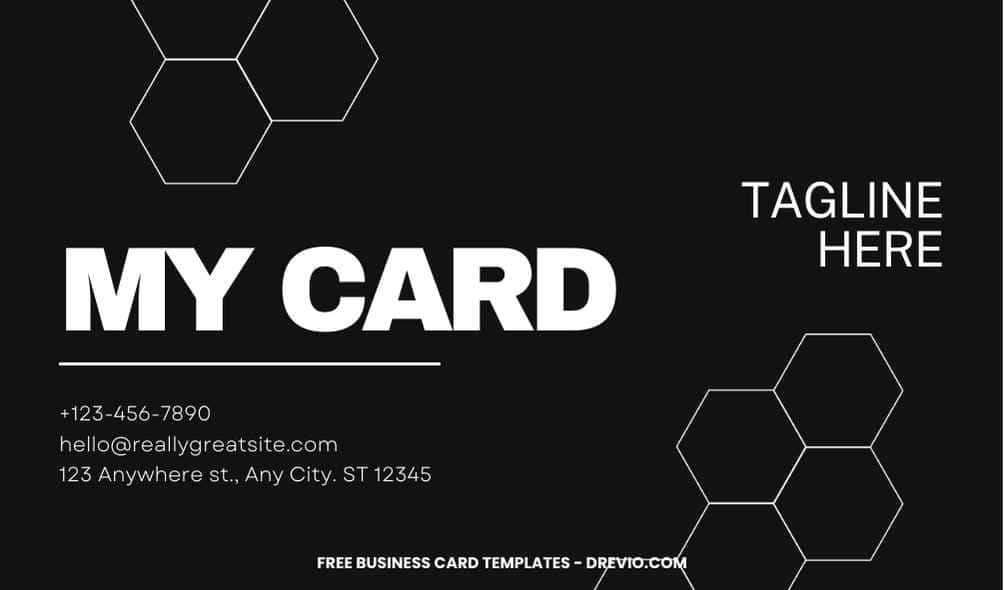
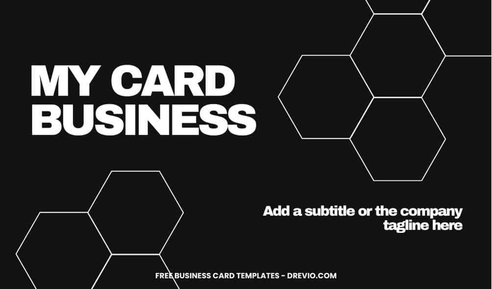
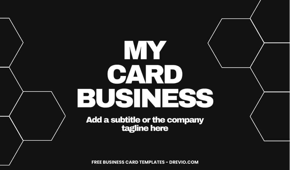
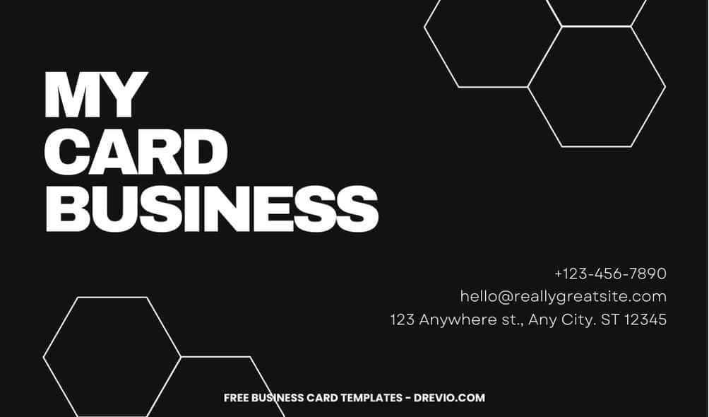
Minimalist Black and White Business Card Template
And now, the pièce de résistance… we’d be remiss if we didn’t share one of our most stunning minimalist black and white business card templates with you!
Imagine a card crafted from luxurious black paper, adorned with your logo in a crisp silver foil. Your name dances in stark white, a confident serif font that demands attention.
The back whispers your tagline in a subtle grey, leaving a lingering memory of your brand’s essence. This is just a taste of the magic that awaits – explore our collection and find the perfect minimalist black and white canvas to paint your brand story on.
How to Download
- What you need to do is click (left-click) the preview image.
- You should see a new page popped-up in your display, then you need to “right-click” the image and select “Save image as”
- Locate the destination folder, or just leave it as it is. Then “Enter” to start the download process.
Please note this, all files/materials have been included in that package, so once it’s finished, you are able to customize it right away.
customize your invitation here
So, ditch the design drama and embrace the power of simplicity. Go forth and conquer the world with your minimalist black and white business card – a silent symphony of style that speaks volumes about your brand’s essence. Remember,it’s not just a card, it’s a statement. Make it bold, make it beautiful, and make it uniquely you.


