How to Design the Perfect Business Card for Your Brand
So just what goes into a good business card design? Here are the main elements to keep in mind.
Be Mindful of Your Font
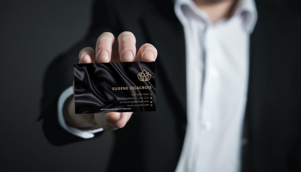
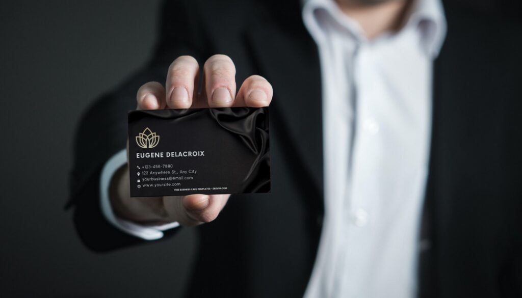
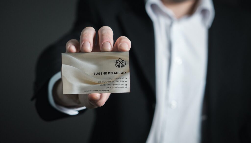
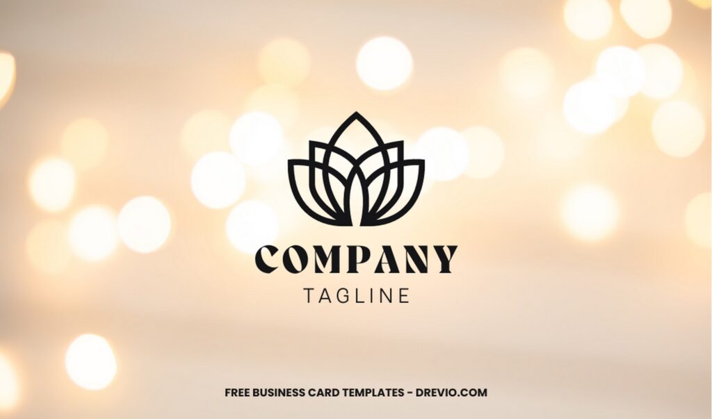
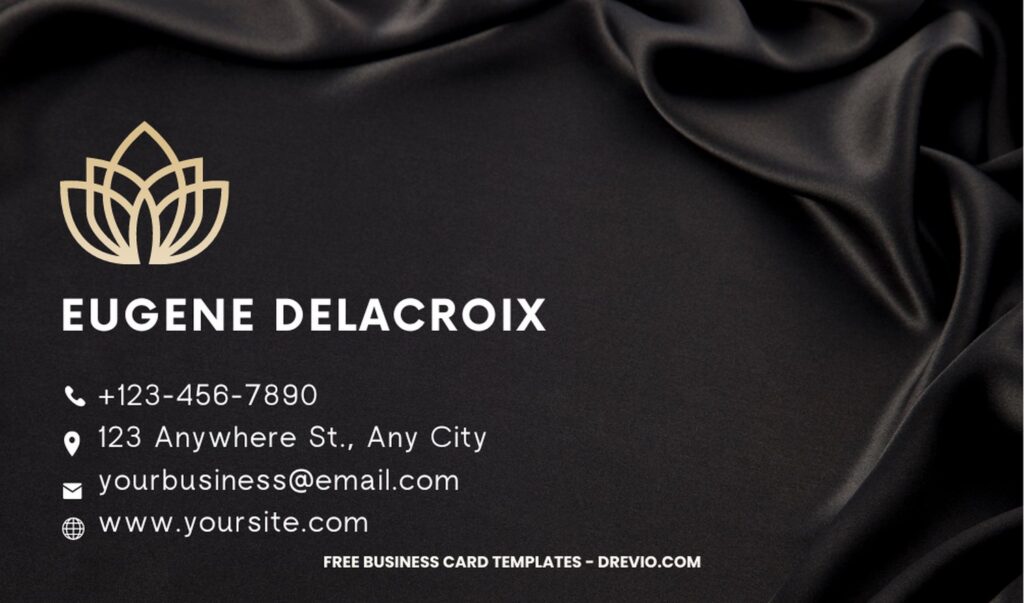
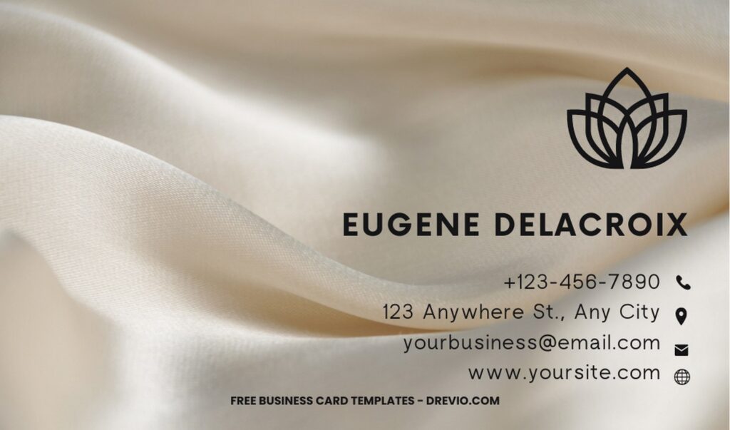
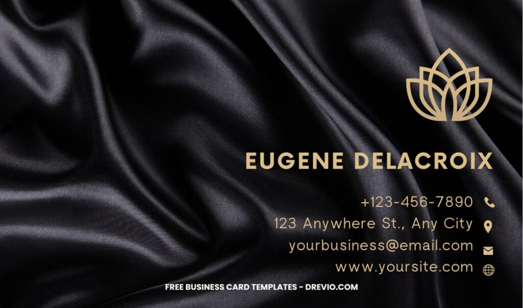
Because business cards feature mostly text, your choice of font will have a huge impact on the overall look and feel of the finished product. Fonts, like colors, are a powerful design element that have the ability to communicate your brand’s personality. See examples below.
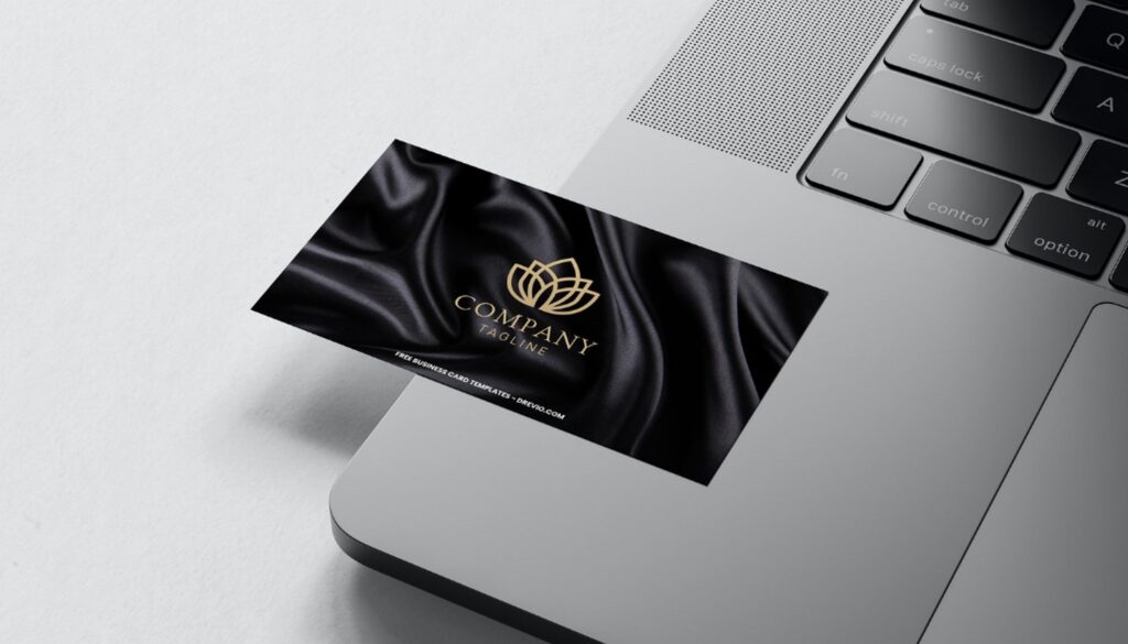
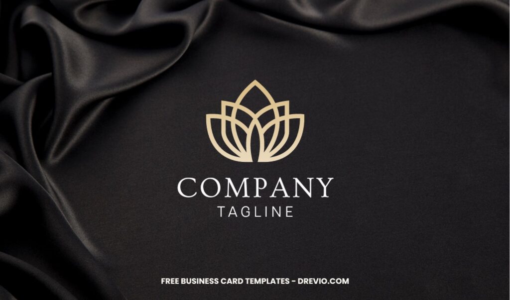
Here is when having a basic understanding of typography is useful. Typography, which encompasses factors like font, structure, legibility, and clarity, is essentially the art of designing text. The readability of your business card can be greatly impacted by your choice of typeface and font. FYI, thanks to the classy “Silk” or “Liquid Marble” background, the level of readability should be a top priority since your card has to be comprehensible at just a glance. It can be tempting to load up your business card with fancy fonts and other snazzy design elements, but if they make it harder to read the text, then they’re the wrong choice.
Typography Design
Typographic Business Cards: Designing Business Cards That Make an Impression, even though many printed materials have gone the way of the dodo in the internet age, there is still one that has managed to stay relevant and useful even among smartphones and digital devices: the business card.
Beginner’s Guides
Follow this instruction to use & download our templates:
- Scroll-up a bit and you should see the provided link that says “EDIT NOW ON CANVA”, point your mouse pointer there and click it.
- You will be directed to Canva page in seconds and now you can instantly edit/customize our template designs and download the file.
- How to download: Move your mouse pointer onto the “File” button (top-left) > Download > File Type > Choose One > Click the Download button.


