Are you in the process of planning your dream wedding, but feeling overwhelmed by all the details? Let me take one thing off your plate: choosing the right invitations.
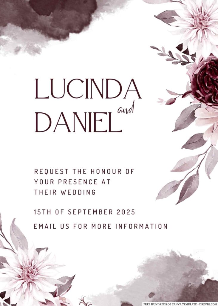
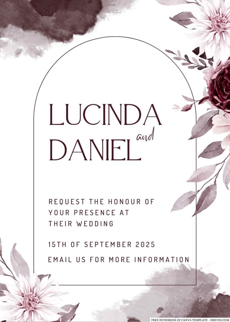
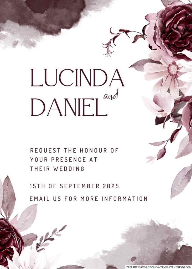
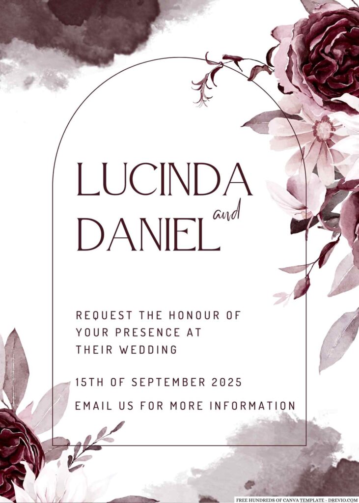
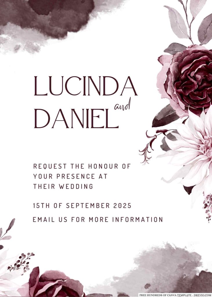
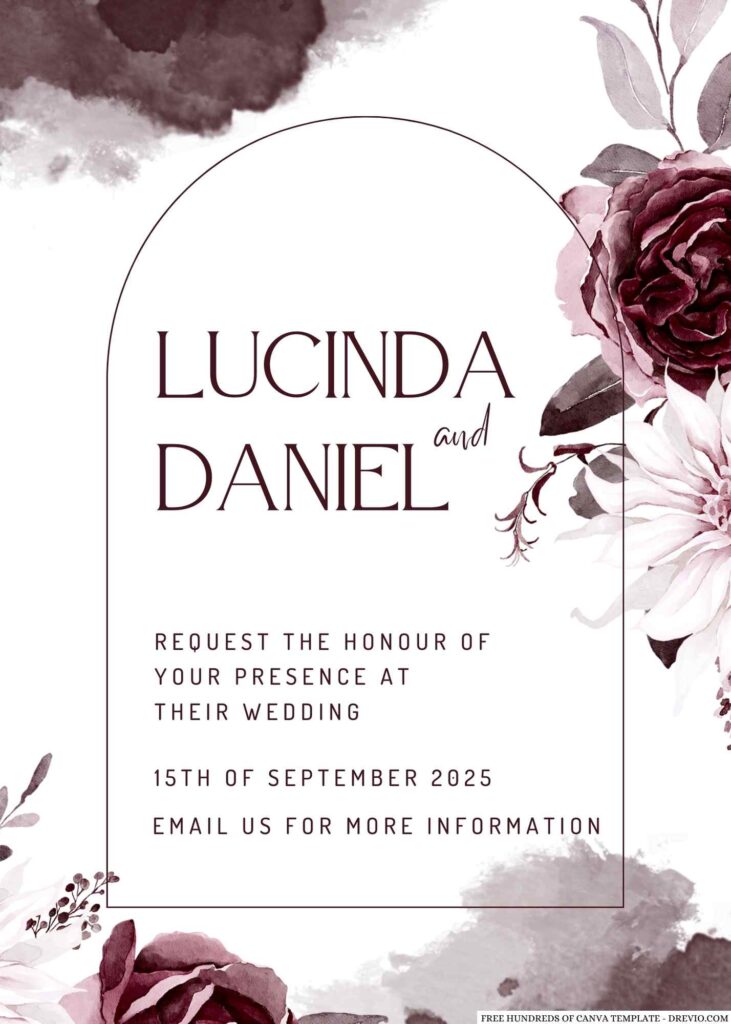
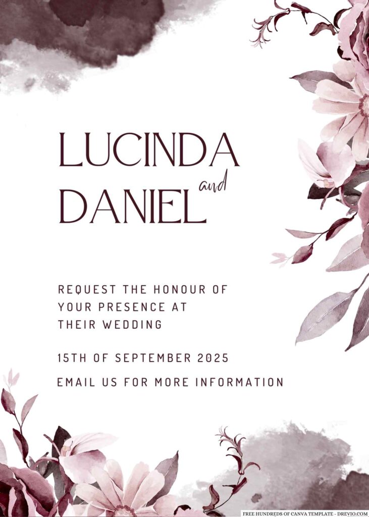
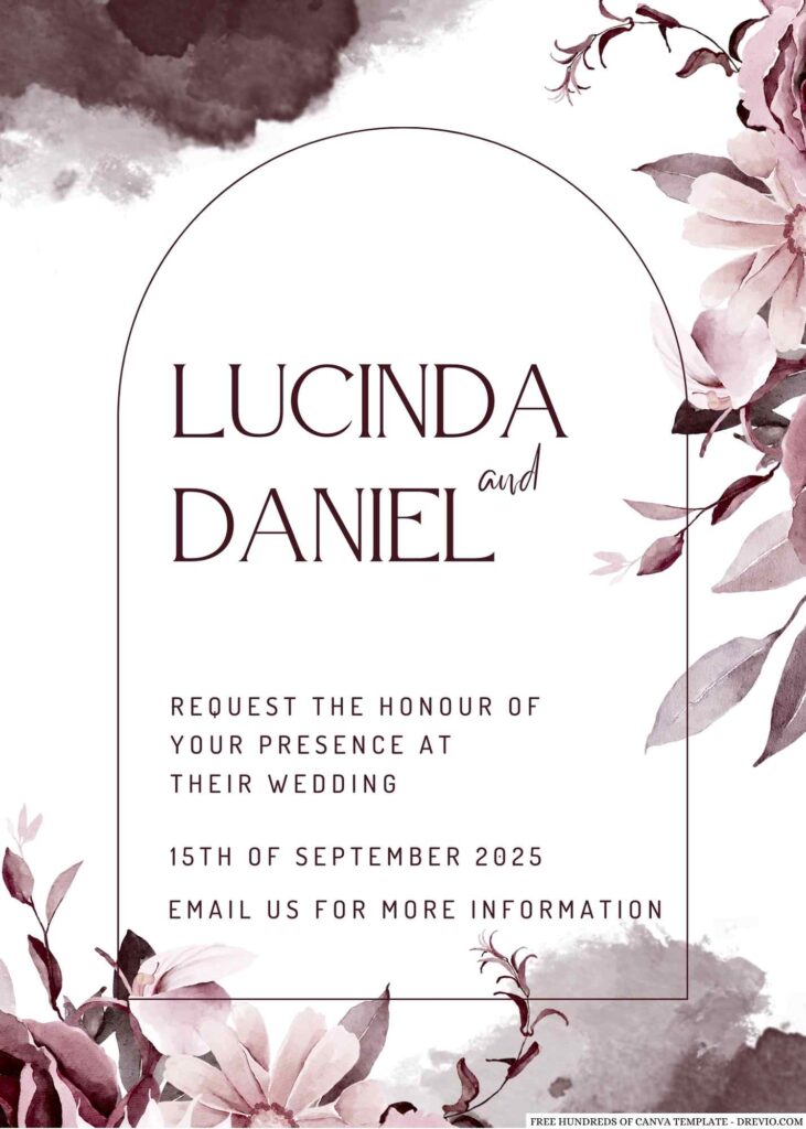
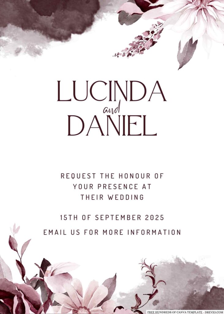
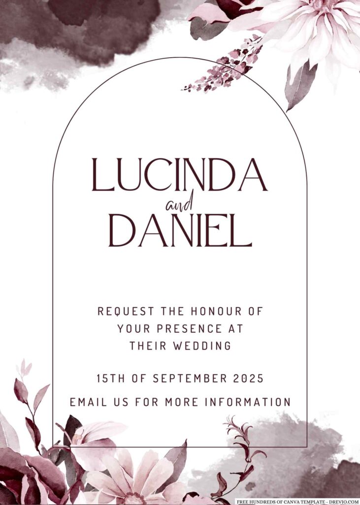
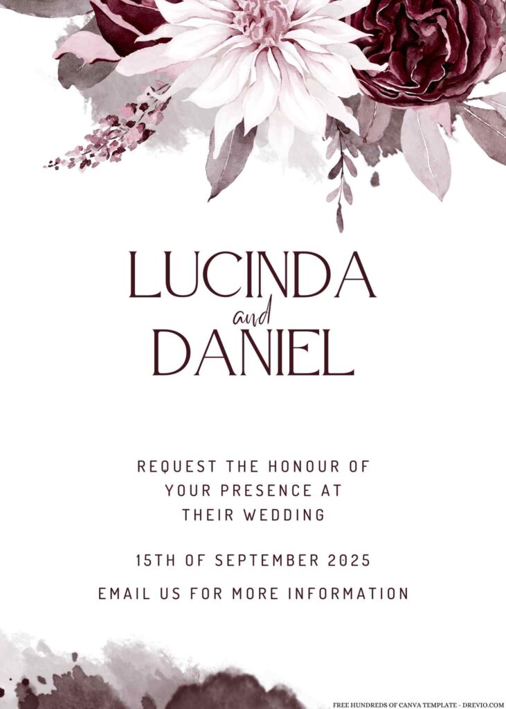
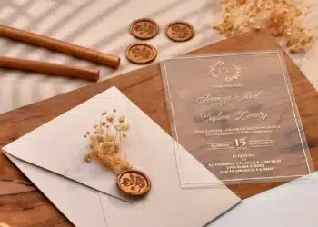
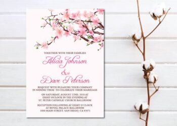
Our new floral burgundy wedding invitations are the perfect combination of beautiful design and practicality.
The floral design is delicate and feminine, while the burgundy color adds a touch of sophistication and elegance.
And, with the ability to customize through Canva for free, you can make these invitations truly unique to your special day.
How to Download
- What you need to do is click (left-click) the preview image.
- You should see a new page popped-up in your display, then you need to “right-click” the image and select “Save image as”
- Locate the destination folder, or just leave it as it is. Then “Enter” to start the download process.
Please note this, all files/materials have been included in that package, so once it’s finished, you are able to customize it right away.
customize your invitation here
Coordinating Your Wedding Stationery for a Cohesive Look
Planning a wedding is no small feat, and there are a lot of details to consider to make sure your special day is picture-perfect. One important aspect is your wedding stationery, including invitations, save the date cards, RSVP cards, and more.
But how can you make sure that all of these pieces work together seamlessly? The answer is simple: by coordinating your wedding stationery for a cohesive look.
Think of your wedding stationery as an extension of your wedding day décor. Just as you would choose a specific color palette, flowers, and centerpieces to match your theme, you should also choose stationery that reflects your style and theme.
From the fonts you use to the images and patterns you choose, your wedding stationery should all tie together for a polished, put-together look.
One of the easiest ways to coordinate your wedding stationery is by choosing a consistent color palette. This doesn’t mean that every piece of stationery has to be the exact same color, but rather that the colors you choose should complement each other and match your wedding theme.
For example, if you’re having a rustic, earthy wedding, you might choose a palette of warm, natural shades like browns, greens, and golds. On the other hand, if you’re having a glam, elegant wedding, you might choose a palette of glittery metallics, rich jewel tones, and black or white.
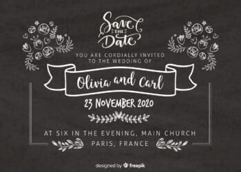
Another way to coordinate your wedding stationery is by using consistent elements throughout your suite. For example, you might use the same font style on your invitation, save the date card, and RSVP card. You could also use a common symbol or image, such as a heart or a flower, to tie everything together.
Finally, consider the overall look and feel of each piece of stationery. Do you want a traditional, formal look with classic typography and elegant embellishments?
Or are you looking for something more modern and minimalist, with clean lines and simple graphics? Whatever look you choose, make sure that all of your pieces have a consistent style and design aesthetic.


