In a world awash in color, sometimes the most striking impression comes from the stark elegance of black and white. And when it comes to business cards, these classic shades can be the canvas for something truly unforgettable.
Ditch the graphic confetti and neon splashes – let’s craft a monochrome masterpiece that whispers sophistication and leaves a lasting impact.
But hold on, before you grab that Sharpie and start doodling, let’s delve into the art of the black and white business card.Think of it as your personal mini billboard, and you want to make sure it screams quality, not “photocopied flyer from the corner store.” Here are some tips to turn your monochrome muse into a magnetic masterpiece:
Less is More
Embrace the minimalist mantra. With no color distractions, every element needs to sing. Use clean lines,sharp fonts, and ample negative space. Think Mondrian, not Jackson Pollock.
Remember, minimalism isn’t about emptiness, it’s about intentionality. Make each design choice count, like a perfectly placed brushstroke in a Japanese ink wash painting.
Font Frenzy
Let your typography take center stage. Choose a classic font that pairs well with your brand personality.Think sleek serifs for a touch of sophistication, or bold sans-serifs for a modern edge. Play with size and weight to create hierarchy and visual interest. And for the love of all things professional, please, no Comic Sans!
Texture Tales
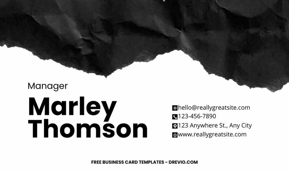
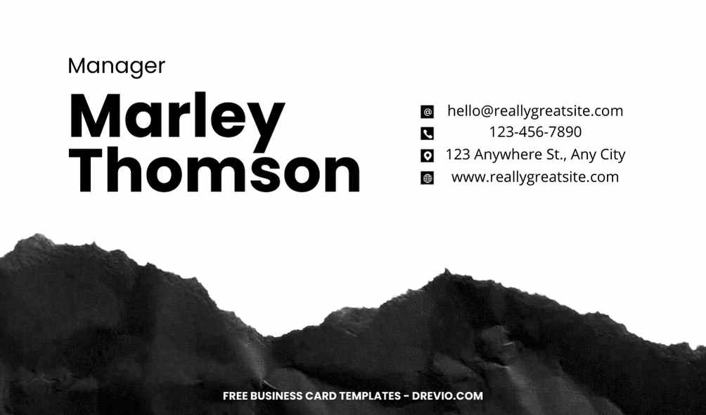
Don’t just settle for flat black and white. Explore the tactile dimension with textured paper stocks. A lightly embossed logo can add a subtle touch of luxury, while a rough-edged card can give off a cool, contemporary vibe.Think about how the texture feels in your hand, it should be an extension of your brand’s personality.
Paper Panache
Go beyond the boring. Choose a paper stock that complements your design. A thick, linen-textured card screams quality, while a recycled paper with natural flecks adds an eco-conscious touch. Don’t underestimate the power of paper – it’s the foundation of your mini-masterpiece, so choose wisely!
And Now, for the Reveal
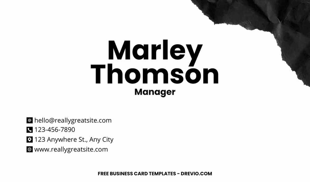
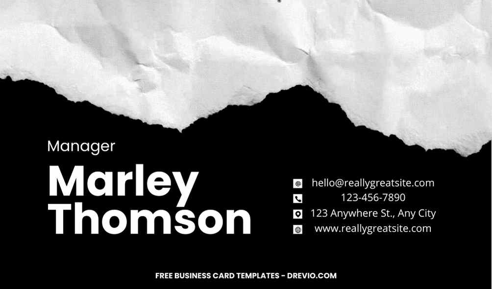
Remember, we promised you an amazing black and white business card inspiration? Feast your eyes on this beauty:
Card Canvas
Imagine a deep, charcoal grey card stock with a slightly rough edge. In the center, your company logo shines in crisp white, perhaps a simple line drawing or geometric shape.
Below, your name and title are displayed in a bold, sans-serif font, while your contact information is neatly arranged underneath in a smaller, but equally elegant, font. The back of the card remains minimalist, maybe with a subtle pattern or your website URL in a discreet white.
How to Download
- What you need to do is click (left-click) the preview image.
- You should see a new page popped-up in your display, then you need to “right-click” the image and select “Save image as”
- Locate the destination folder, or just leave it as it is. Then “Enter” to start the download process.
Please note this, all files/materials have been included in that package, so once it’s finished, you are able to customize it right away.
This is just a taste of the black and white business card possibilities. Let your creativity run wild, experiment with different fonts, textures, and layouts. Remember, the key is to keep it clean, intentional, and true to your brand.
customize your invitation here
Conclusion
So, ditch the rainbow and embrace the monochrome magic. With a little creativity and these handy tips, you’ll craft a business card that’s not just a piece of paper, it’s a statement piece.
A silent yet powerful declaration of your professionalism and good taste. And who knows, it might just be the conversation starter that lands you your next big deal.
Now go forth and conquer the monochrome world of business cards! We can’t wait to see your masterpiece.


