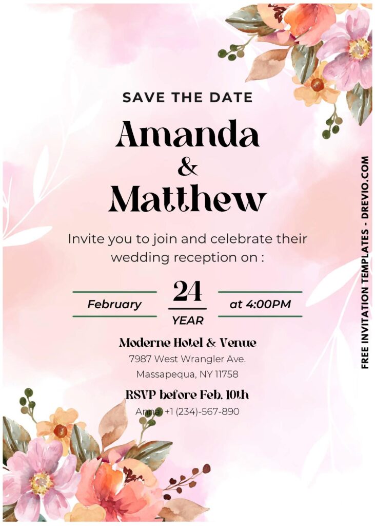
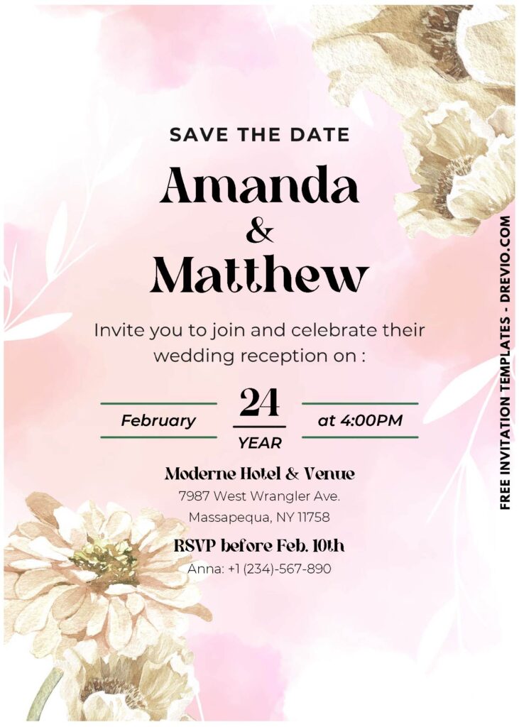
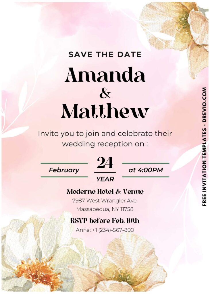
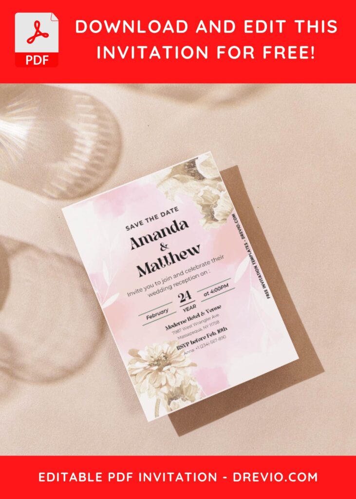
Working with a vibrant color palette can be intimidating, even for the most experienced artists. What’s the reason? People believe that muted tones are superior due to their elegance, romanticism, and adaptability to almost any style.
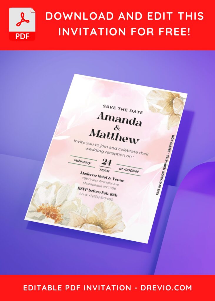
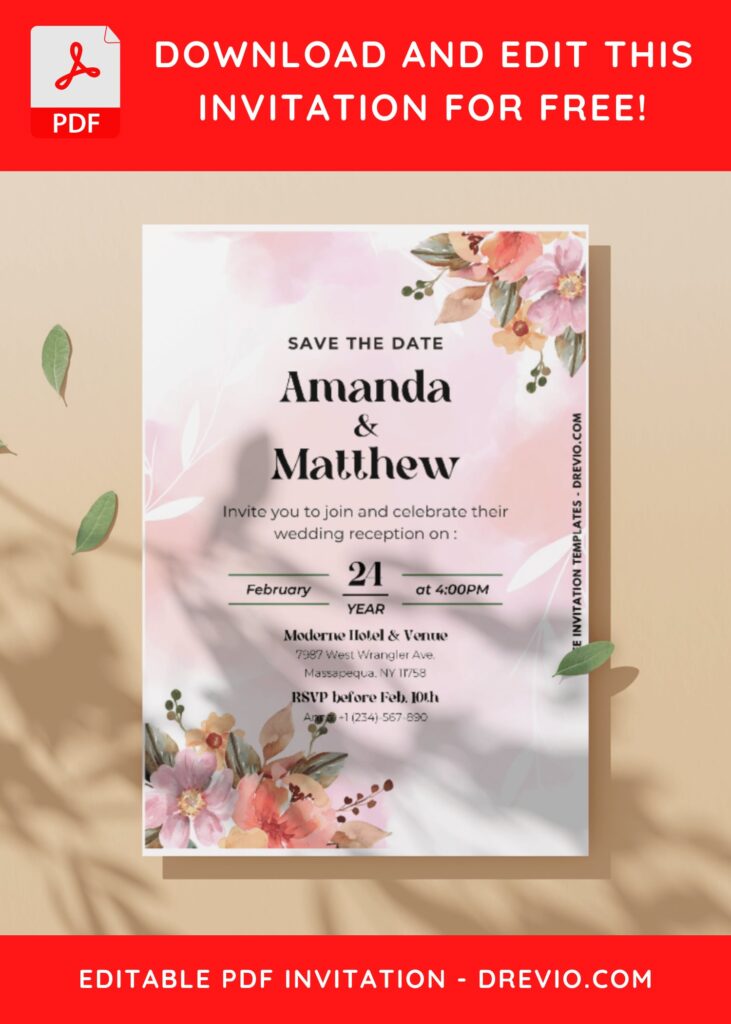
Delicate tones, such as red, blush, and pink, are ideal for events where you want to emphasize and highlight bold elements for a unique and elegant appearance. Where is this subtle color palette most commonly used? Exquisite party invitations are one of the things that always make people happy, and I’ve taken the liberty of creating a few layouts for you. Let’s get into the specifics below!
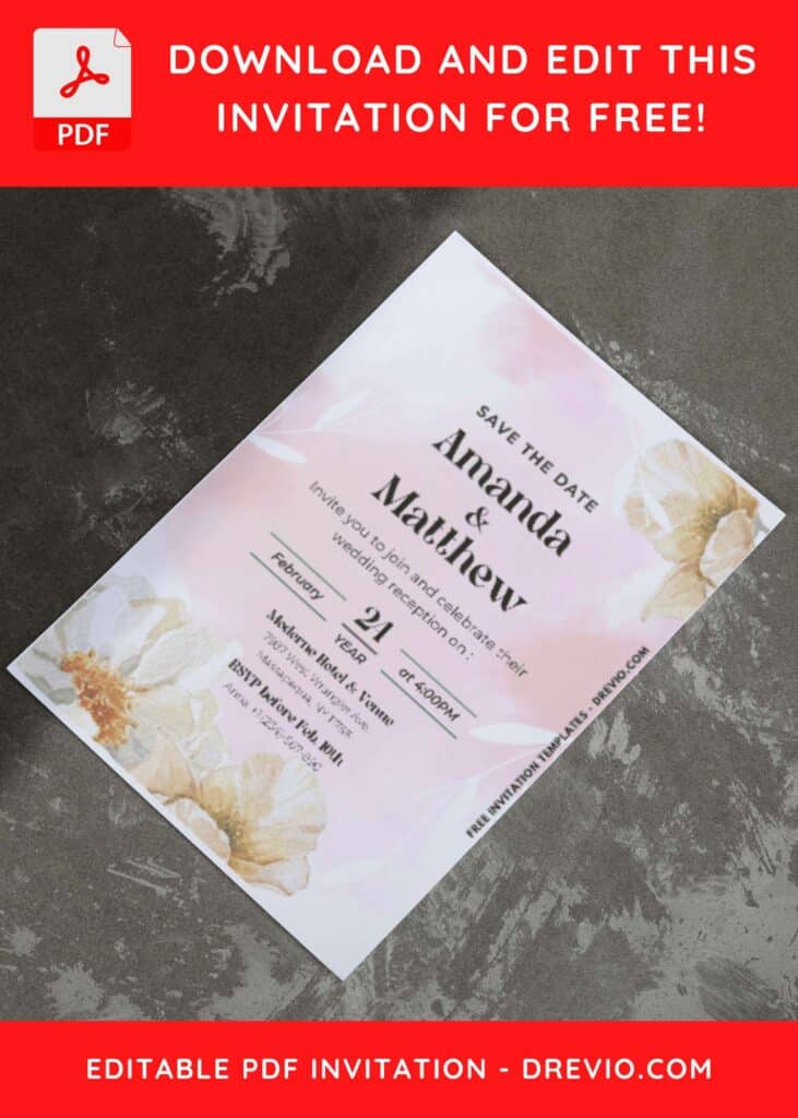
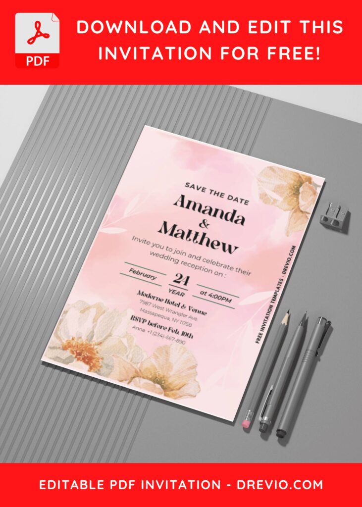
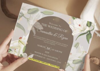
With the refined natural hues and complementing floral graphics, you’re in for a visual treat like no other. It may seem unconventional to pair these elements with quirky shapes seemingly out of nowhere, but the more you gaze upon it, the more captivated you become by its beauty!
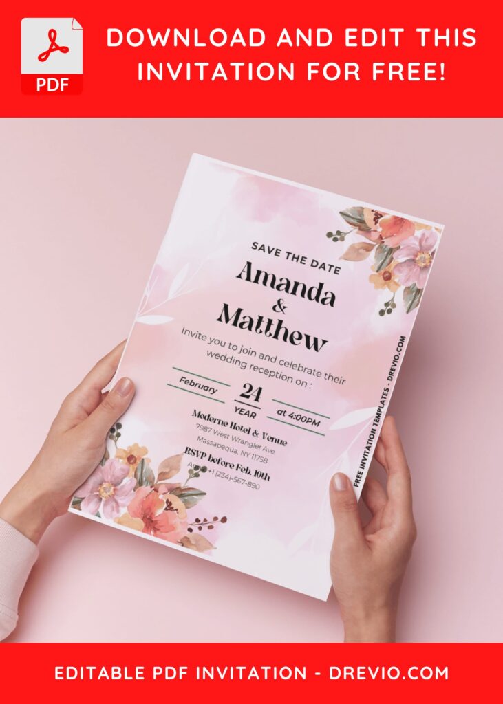
DOWNLOAD FREE EDITABLE PDF INVITATION HERE
The central layer of this collection also features truly aesthetic blush-toned brushstrokes, as I aimed to capture a natural aesthetic and fuse it with a modern, alluring ombre watercolor background design. Once I had completed this phase, I proceeded to enhance every element for an even more impressive result.
Download Information
Follow this instruction to download our templates:
- Scroll-up a bit and you should see the provided link that says “Download Free … Invitation here”, point your mouse pointer there and click it.
- You are going to see Google Drive Page in seconds and now you can download the file by clicking the download button or drop-down arrow (Almost on the top right of your display)
- Tap “Enter” to start the download process.
- Edit the file using Adobe Reader or Foxit Reader or any PDF editor.


